
Loading the latest stories…
SUBKnitting
The incised chevron columns at Durham Cathedral inspired Kate to design a textile that translated stone into fiber.
Kate Larson4 min read
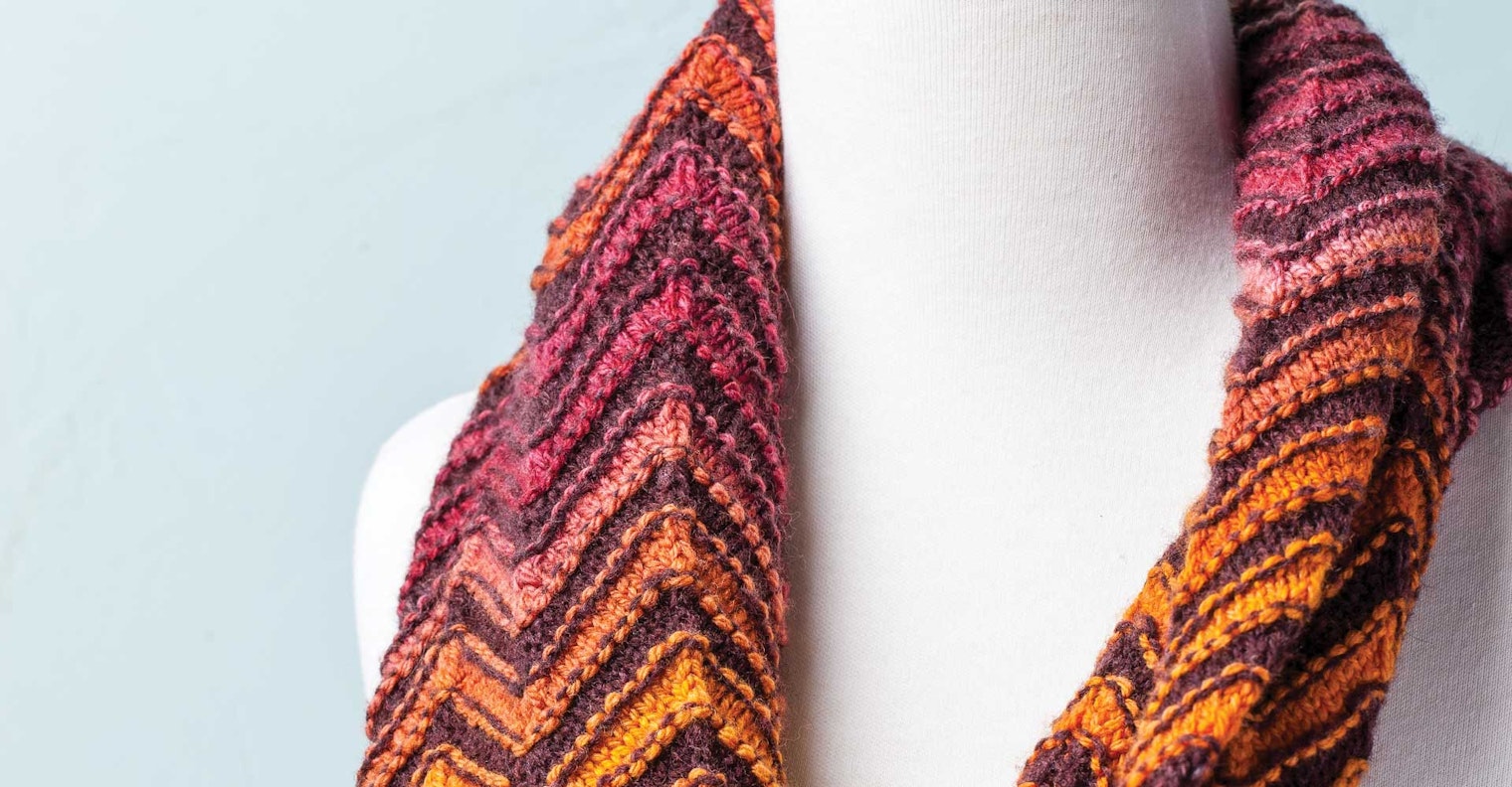
Chevron and zigzag patterns are not just knitters’ motifs. They have been reinterpreted by artists, both ancient and modern, time and again in many mediums. Whether on pottery, in architecture, or embroidered on cloth, these symbols are common to many different cultures around the world. The famous chevron columns of Durham Cathedral in the north of England inspired this cowl, which is knitted as a tube with alternating colors and a bit of texture.
Designing a yarn to meet a grand plan is one of my favorite aspects of handspinning. I choose not only the color of the yarn to create a piece but also its texture, drape, and character. For this project, I designed a cowl with undulating stripes made with two yarns, one airy and sheer and one a bit denser to give the piece shape.

This was a great opportunity to use a worsted-spun, chain-plied yarn to create a gradient effect. Chain plying, also called Navajo plying, allowed me to keep colors distinct when spinning painted combed top and created a round, three-ply yarn. The contrasting roving is spun into a two-ply, woolen-spun yarn that is airy and supple—almost acting as a shadow to the gradient three-ply. Using two different spinning and plying techniques produced two different textures within the same project.

For the main color I used a dreamy Polwarth/silk handpainted combed top dyed by Copper Corgi Fiber Studio, which I spun with a worsted draw. I didn’t split the combed top into smaller strips for spinning because I wanted long color progressions. I chain-plied my handspun singles into a medium-twist, bouncy worsted-weight knitting yarn.
For the contrasting color I used Corriedale roving dyed with cochineal and madder to spin an airy yarn using a woolen draw. The resulting two-ply, sportweight yarn is a finer gauge than the main color, but it has a slightly fuzzy halo and matte appearance.
Log in to see the project instructions. This project was published in the Fall 2015 issue of Spin Off —Editor

Kate wanted to catch the columns’ texture, which is both static and rhythmic, creating a balance of light and shade. Watercolor by Kate Larson
See spinoffmagazine.com for terms you don’t know.
More from Spin Off
From the Library






Comments
No comments yet — be the first to share your thoughts.
Sign in to join the conversation — commenting is for signed-in members.